Case Study
Site Fighter
A punchy platform page for pitching two websites against one another — built around a clear match-up idea, direct UX, and a conversion path that makes sense quickly.
Overview
A new platform idea has to click immediately.
The situation
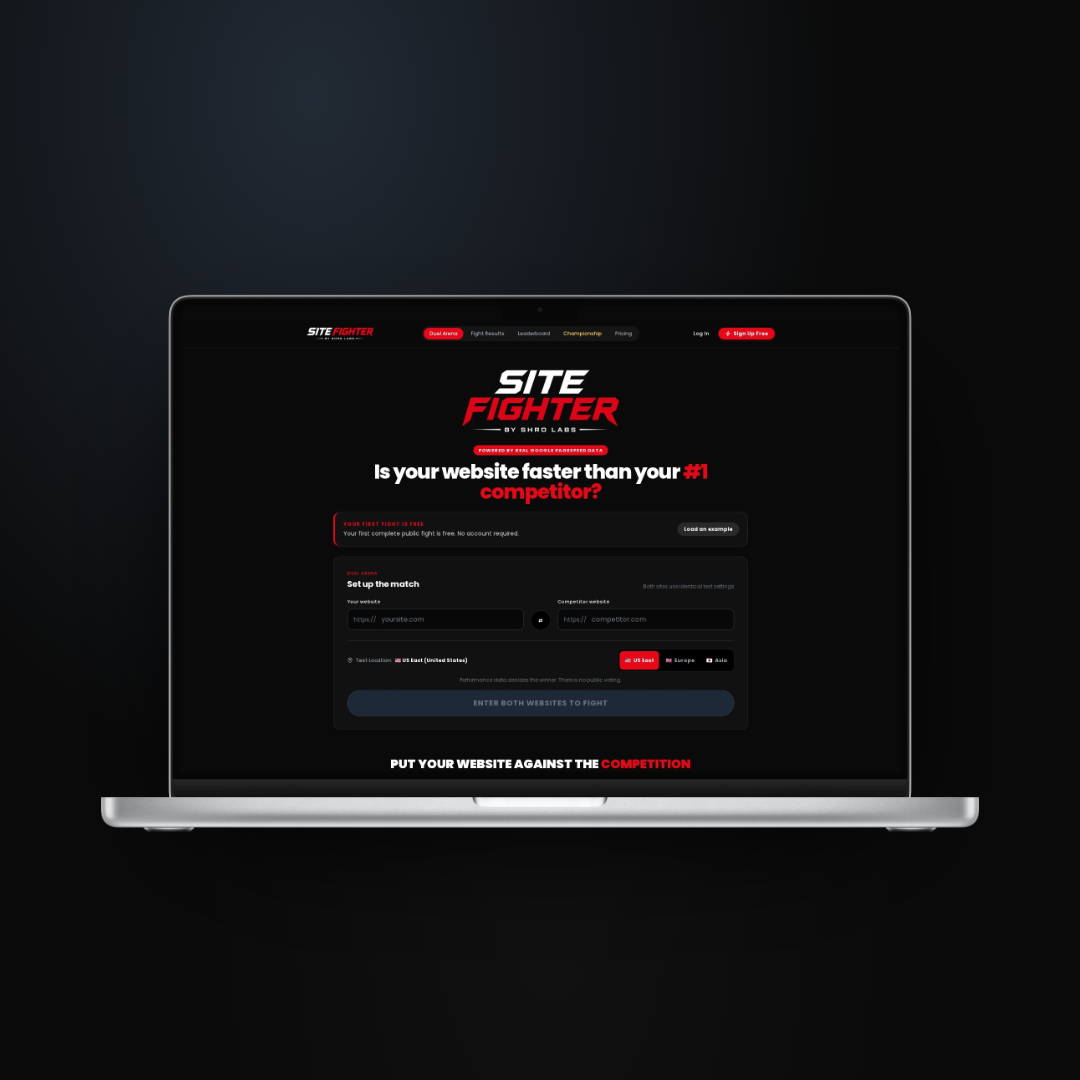
Site Fighter is built around a simple premise: put two sites against one another and see which one performs better. The challenge was making that idea feel instantly understandable and worth trying.
The page needed energy, clarity, and a product interface that could carry the concept without needing a long explanation.
What needed to happen
The core match-up flow had to be visible right away: your website, their website, start the fight. Every label and CTA needed to push visitors toward trying it.
Because the product is competitive by nature, the visual direction needed to feel bold without making the interface messy.
What Was Built
Clear, fast,
made to launch.
A product-led platform page with the core interaction front and centre.
01
Instant Concept Clarity
The hero explains the site-vs-site idea in plain language before the user has to scroll.
02
Match-Up Interface
A two-input flow makes the product tangible and gives visitors an immediate action to take.
03
Competitive Visual System
The red-and-black design gives the platform punch while keeping forms and CTAs clear.
04
Conversion Path
Sign-up and example-loading CTAs help both new visitors and curious users move forward.
05
Responsive Structure
The layout is designed to hold up across desktop and mobile without losing the product-first feel.
06
SEO Foundations
Clear metadata, semantic sections, and descriptive image text keep the page ready for launch.
The Result
Site Fighter now has a clear platform presentation that explains the concept quickly, shows the core interaction, and gives visitors a simple route into trying the product.
Get the same for your business →